


Is this the simplest way to show what is meant by global warming? The chart below organises all the countries of the world by region, time and temperature. The trend is unmistakeable.
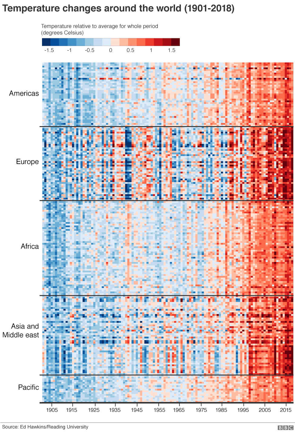

Each line of coloured pixels is the temperature record of an individual nation within its region, stacked one atop the other. Blues are cooler years; the reds are warmer. The far left is 1900; the far right is the present day.
The entire planet has got hotter, increasingly so in recent decades.
This global “Climate Stripes” graphic is the work of Prof Ed Hawkins at Reading University who has sought clearer ways to communicate the issues around climate change – and to start conversations that might lead to solutions.
He got the idea one January – the month the big meteorological agencies release their annual assessments of the state of the climate.
Prof Hawkins experimented with different ways of rendering the agencies’ global data and chanced upon the coloured stripes idea. When he tried out a banner on festival-goers at Hay, he knew he’d struck a chord.
The Reading climate scientist now has a website, #ShowYourStripes, that allows anyone to download the stripes for their country and a few select cities (most stripes are built on global data collated by Berkeley Earth).
People have been turning these patterns into wearable garments – ties, dresses, jumpers, and leggings. Someone in Minnesota in the US has even painted their Tesla car in the stripes.
“What I’ve learnt from this is that you don’t need the numbers to get the message across. The colours will do that,” Prof Hawkins told BBC News.
“It’s all about finding different ways to communicate to people, to tap into different groups, because not everyone has got it. Maybe some of them switch off whenever science is mentioned. This is another way of getting through to them.”
For those with a scientific bent, the graphic at the top of this page will, though, highlight some interesting features that might otherwise be missed in a different rendering of global data.
Notice how the regions do not warm in unison. They appear as discrete blocks, Europe being the most obvious stand-out example. That’s understandable. Each continent is an individual actor in the climate, influencing – and being influenced by – the system as a whole.
Look at the beginning of the 1940s in particular. See how in Europe there is a strong band of blue compared with the rest of the world.
This is quite a well-studied period that was probably linked to a large El Niño event – the climate cycle associated with shifting pressure patterns and a weakening of the trade winds in the Pacific.
The world warmed, apart from Europe which had a deep cold spell. And it probably had an impact on the outcome of WWII. The harsh winters at the time frustrated Hitler’s armies as they invaded the Soviet Union.
[email protected] and follow me on Twitter: @BBCAmos


